Color gamut matters a lot for editing work, but the best choice is not always the widest one. The right color gamut depends on your final output. A photo for a website needs one setup. A print file needs another. A video project needs a different target again.
So, the real question is not “Which color gamut is biggest?” The better question is: “Where will this work be viewed?”
This guide explains sRGB, Adobe RGB, DCI-P3, Display P3, Rec. 709, and Rec. 2020 in clear terms. It also shows which one matters for photo editing, video editing, web design, print work, and HDR projects. Along the way, you will learn what monitor specs matter, what marketing claims to ignore, and how to avoid color problems after export.
What Color Gamut Means
Color gamut means the range of colors a screen, camera, printer, or file can show. A larger gamut can display richer greens, deeper reds, and more saturated tones. That sounds great, but it can create problems too.
For example, a wide-gamut monitor can make colors look rich on your screen. Then the same image can look dull, strange, or oversaturated on another display. This often happens when the app, monitor, and export file do not use the same color space.
So, color gamut is only one part of a good editing setup. Color accuracy matters too. Calibration matters. Brightness, contrast, bit depth, panel type, and room lighting all affect the final result.
A good monitor does not just show more colors. It shows the correct colors.
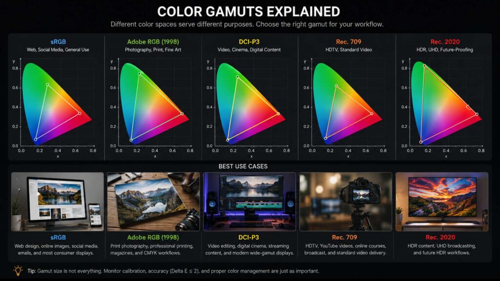
sRGB: The Best Color Gamut for Web Content
sRGB is the safest choice for most online work. It suits websites, blogs, social media posts, ecommerce images, email graphics, and standard digital delivery.
Most online platforms handle sRGB well. Most browsers expect it too. For that reason, sRGB gives you the most predictable result across laptops, phones, tablets, and office monitors.
If you edit product images, thumbnails, blog graphics, or web banners, focus on strong sRGB coverage first. A monitor with 99% to 100% sRGB gives you a solid base.
Look for these specs:
- 99% to 100% sRGB coverage
- Delta E under 2
- Factory calibration report
- IPS, OLED, or a high-grade VA panel
- Good brightness control
- Even lighting across the screen
- A proper sRGB mode
Still, sRGB coverage alone does not prove the monitor is accurate. A cheap screen can claim 100% sRGB and still show poor whites, weak shadows, or uneven brightness.
For web creators, accuracy beats huge color range. A clean 100% sRGB display will serve most online work better than a wide-gamut display with poor controls.
Adobe RGB: Better for Print Photography
Adobe RGB covers more green and cyan tones than sRGB. This matters for print work, mainly high-end photography and fine art printing.
A printer can often reproduce colors that sit outside the sRGB range. For that reason, Adobe RGB helps keep more color data during editing. This is useful for landscapes, product photos, catalogs, posters, magazines, and gallery prints.
Adobe RGB works best for:
- Fine art photography
- Landscape prints
- Product catalogs
- Magazine layouts
- Large-format prints
- Studio photography
- Soft proofing for print labs
- CMYK print preparation
If print work matters to you, look for a monitor with close to 99% Adobe RGB coverage. That gives you a better view of printable greens, blues, and blue-green tones.
Still, do not export normal web images in Adobe RGB. Many screens and apps now handle color profiles better than before, but sRGB still gives safer online results.
A smart workflow looks like this: edit the print file in Adobe RGB or a wider working space, soft proof it for the printer, then export a separate sRGB version for the web.
DCI-P3 and Display P3: Best for Modern Screens and Video
DCI-P3 started in digital cinema. Today, P3 color also matters for phones, tablets, laptops, streaming content, and modern wide-gamut displays.
Display P3 is common on many Apple screens. It uses the P3 color range with a tone response that works well for modern apps and web visuals.
So, P3 matters if you edit content for newer screens. It can show richer reds and greens than sRGB. It also gives video editors more room to judge color.
DCI-P3 and Display P3 suit:
- Video editing
- Mobile content
- Short-form social videos
- Streaming content
- Modern web design
- App previews
- Wide-gamut photography
- Apple device workflows
For most video editors, a monitor with 95% or more DCI-P3 coverage is a strong choice. It gives enough room for modern color work without pushing you into expensive HDR reference monitor territory.
That said, P3 only helps if your workflow supports it. Your editing app, timeline settings, export settings, and monitor mode must match. Otherwise, colors can shift after export.
Rec. 709: The Standard for Most Video Editing
Rec. 709 matters for standard video work. It is the common target for SDR video, HDTV, YouTube videos, online courses, interviews, client ads, and many social clips.
Many people shop for DCI-P3 first and forget Rec. 709. That can lead to oversaturated video. A clip can look great on your wide-gamut monitor but too intense on normal screens.
For SDR video, Rec. 709 should be your main target. A good video editing monitor should have a clear Rec. 709 mode. It should also handle gamma and grayscale well.
Look for:
- 100% Rec. 709 or sRGB coverage
- Accurate Rec. 709 preset
- Delta E under 2
- Stable gamma
- 10-bit signal support
- Good shadow detail
- Manual brightness control
Rec. 709 and sRGB have a similar color range, but video workflows handle tone and viewing conditions in a different way. For casual editing, the difference can feel small. For paid client work, use the proper Rec. 709 mode.
Rec. 2020: Useful for HDR, Not Needed for Most Creators
Rec. 2020 is a very wide color space used in UHD and HDR workflows. It covers far more color than sRGB, Adobe RGB, or DCI-P3.
Still, most consumer monitors cannot display full Rec. 2020. Many HDR workflows use Rec. 2020 as a container, then place actual mastered colors closer to P3 inside that space.
Rec. 2020 matters for:
- HDR video
- UHD broadcast work
- High-end film delivery
- Dolby Vision projects
- HDR10 workflows
- Advanced color grading
For most creators, Rec. 2020 should not be the main buying factor. Strong DCI-P3 coverage, real HDR brightness, excellent contrast, and proper calibration matter more.
If you do not deliver HDR work, do not pay extra only for a Rec. 2020 claim. Spend that money on a better panel, stronger accuracy, and better screen uniformity.
Color Coverage vs Color Accuracy
Color coverage tells you how many colors a monitor can show. Color accuracy tells you how close those colors are to the correct target.
For editing, accuracy matters more.
A monitor can cover 98% DCI-P3 and still show wrong skin tones. Another monitor can cover 100% sRGB with excellent accuracy and give better results for web work.
Delta E helps measure color error. Lower numbers mean better accuracy.
Use this simple guide:
- Delta E under 1: excellent for color-critical work
- Delta E under 2: very good for photo, web, and video editing
- Delta E under 3: usable for general creator work
- Delta E over 3: visible color errors can appear
Factory calibration helps, but screens change over time. Brightness shifts. White balance drifts. Room light changes how you see color.
So, a calibration tool helps a lot. A colorimeter measures your screen and creates a profile that helps your computer show color more accurately.
Bit Depth and Banding
Bit depth controls how many color steps a monitor can show. An 8-bit monitor displays 16.7 million colors. A 10-bit monitor can display over 1 billion color values.
For normal web images, 8-bit can work well. For heavy photo edits, video grading, gradients, and HDR work, 10-bit support helps reduce banding.
Banding appears as visible lines between color tones. You often see it in skies, shadows, soft backgrounds, and smooth gradients.
Still, the full setup must support 10-bit output:
- Monitor
- Graphics card
- Cable
- Editing software
- Operating system settings
- File type or timeline settings
Some monitors use 8-bit plus FRC to simulate 10-bit color. This can look good for many creators. True 10-bit panels suit higher-end color work better.
Which Color Gamut Should You Use?
The best color gamut depends on your main work.
Use sRGB for web content, blog images, ecommerce photos, thumbnails, and social media graphics. It gives the safest result across common screens.
Use Adobe RGB for print photography, product catalogs, fine art prints, and magazine work. It keeps more printable color data, mainly in greens and cyans.
Use DCI-P3 or Display P3 for modern video work, mobile content, app previews, and wide-gamut screen delivery.
Use Rec. 709 for standard SDR video. This is the best target for most YouTube videos, interviews, courses, and client promos.
Use Rec. 2020 for HDR and UHD workflows. This only matters if you deliver HDR content and use proper grading tools.
A strong all-round creator monitor should offer:
- 100% sRGB
- 95% or more DCI-P3
- Accurate Rec. 709 mode
- Strong Adobe RGB coverage for print work
- Delta E under 2
- Calibration support
- Good brightness uniformity
- 10-bit signal support
Screen size and resolution matter too. If you edit detailed photos, timelines, or large design files, a sharper display can help your workflow. You can compare practical screen choices in this 1440p vs 4K monitor guide.
Best Color Gamut for Photo Editing
Photo editing starts with delivery.
For online galleries, blogs, client previews, and social media, sRGB is the right target. It keeps colors predictable on common screens.
For print work, Adobe RGB gives better room for color. This matters most with landscapes, fashion, product photography, and fine art prints.
Many photographers shoot RAW, edit in a wide working space, then export to the final color profile. That workflow works well, but the monitor still needs to show the target color space with accuracy.
For photo editing, look for:
- 100% sRGB for web delivery
- 99% Adobe RGB for print work
- Delta E under 2
- Hardware or software calibration
- Good screen uniformity
- Matte finish for bright rooms
- Stable brightness at lower levels
A very bright monitor can look impressive in a store. At a desk, it can make you edit photos too dark. Set brightness to suit your room. Many editors work around 100 to 160 nits for standard photo tasks, based on lighting.
Best Color Gamut for Video Editing
Video editing needs a clear target. For most SDR projects, Rec. 709 comes first.
If you edit YouTube videos, client interviews, online lessons, or social ads, use Rec. 709. It gives a reliable standard for common video delivery.
For modern wide-gamut screens, DCI-P3 or Display P3 helps. This matters for mobile-first content, streaming visuals, and richer screen delivery.
For HDR, you need more than a wide color gamut. You need true HDR brightness, high contrast, strong black levels, and proper HDR monitoring.
A good video editing monitor should include:
- Rec. 709 mode
- 95% or more DCI-P3 coverage
- 10-bit signal support
- Good contrast
- Accurate gray balance
- Manual gamma settings
- Calibration support
Connectivity matters here too. A monitor with USB-C can reduce desk clutter, charge a laptop, and carry video through one cable. For creator desks, this USB-C monitor buying guide explains the specs that matter before buying.
Monitor Specs That Matter More Than Big Claims
Monitor ads often push large numbers. You might see 125% sRGB, 98% P3, HDR ready, or 1 billion colors. Some claims help. Others need context.
For editing work, check the full spec sheet:
- sRGB coverage
- Adobe RGB coverage
- DCI-P3 coverage
- Rec. 709 mode
- Delta E rating
- Factory calibration report
- Panel uniformity
- 8-bit, 8-bit plus FRC, or true 10-bit color
- Brightness range
- White point controls
- Gamma controls
- USB-C, DisplayPort, and HDMI bandwidth
- Matte or glossy screen finish
Do not buy only from one big number. A monitor with great sRGB accuracy can beat a cheap wide-gamut monitor for web work. A monitor with strong Rec. 709 mode can beat a flashy P3 monitor for standard video.
Common Color Gamut Mistakes
Many color problems come from mixed settings. The monitor uses one color mode. The app uses another. The export file uses a third. Then the image looks different after upload.
Avoid these mistakes:
- Editing sRGB images in a wide-gamut mode with no color management
- Uploading Adobe RGB files to platforms that expect sRGB
- Grading SDR video in HDR mode
- Trusting vivid or cinema presets for paid work
- Setting screen brightness too high
- Ignoring room lighting
- Buying a wide-gamut monitor with poor accuracy
- Skipping calibration for long periods
- Exporting without checking the final color profile
Use standard modes for serious editing. Save vivid, gaming, and movie modes for casual viewing.
Final Advice: Match the Gamut to the Work
The best color gamut for editing is the one that matches your final output.
Choose sRGB for web content, social media, ecommerce images, and standard digital delivery. Choose Adobe RGB for serious print photography and print design. Choose Rec. 709 for standard video editing. Choose DCI-P3 or Display P3 for modern screens and richer video work. Choose Rec. 2020 only for HDR and UHD delivery.
Still, do not chase the widest gamut first. Start with accuracy. Then check calibration, screen uniformity, bit depth, and proper color modes.
A good editing monitor should not make every image look more intense. It should help you make better decisions. That means correct whites, natural skin tones, clean gradients, and predictable exports.
For most creators, the best choice is a monitor with 100% sRGB, strong DCI-P3 coverage, a good Rec. 709 mode, Delta E under 2, and proper calibration support. Print photographers should add high Adobe RGB coverage to that list.
Color gamut matters. Yet accuracy, workflow, and export settings matter just as much. Get those right, and your edits will look closer to what you intended on screens, prints, and client devices.